10 TOP PRINCIPLES OF EFFECTIVE WEB DESIGN
- Purpose: Each page of your website needs to have a clear purpose, and to fulfill a specific need for your website users in the most effective way possible.
- Communication: Make your information easy to read and digest. Some effective tactics to include in your web design are: organising information using headlines and sub headlines, using bullet points instead of long windy sentences.
- Typefaces: The ideal font size for reading easily online is 16px and stick to a maximum of 3 typefaces in a maximum of 3 point sizes to keep your design streamlined.
- Colours: Using contrasting colours for the text and background will make reading easier on the eye.
- Images: Choosing the right images for your website can help with brand positioning and connecting with your target audience. Also consider using videos and graphics as these can be much more effective at communicating than even the most well written piece of text.
- Navigation: Navigation is about how easy it is for people to take action and move around your website.
- Grid Based Layouts: Placing content randomly on your web page can end up with a haphazard appearance that is messy. Grid based layouts arrange content into sections, columns and boxes that line up and feel balanced, which leads to a better looking website design.
- “F” Pattern Design: People scan computer screens in an “F” pattern. Effectively designed websites will work with a reader’s natural behaviour and display information in order of importance (left to right, and top to bottom).
- Load Time: Everybody hates a website that takes ages to load. Tips: optimising image sizes (size and scale), combining code into a central CSS and minify HTML, CSS, JavaScript.
- Mobile Friendly: It is now commonplace to access websites from multiple devices with multiple screen sizes, so it is important to consider if your website is mobile friendly.
Ashwood High School Website
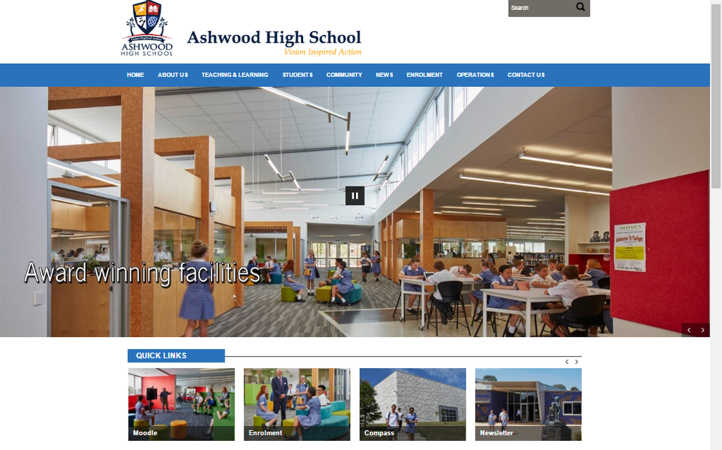
This website's navigation is excellent. There is a search bar on the top right corner and a bar on top of the website to help you navigate different parts and pages of the website. It also has quick links to websites that you might want to use. The website looks very organised, with arranged content into sections, columns and boxes, which makes it feel balanced. It is mobile friendly and its loading time is quite average. It is easy to read and all the images and colours make it look beautiful.
McDonald's Australia Website
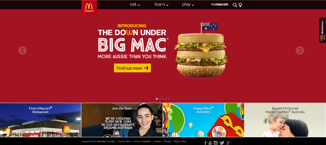
The McDonald's website has provided us with its theme colours of red and yellow and a search bar to look around the website. It is also really important that there is a contact area on the bottom where it provides us with its social media accounts. The website is well structured and organised with different topics on the top bar and a few more topics covered with photos below. It's balanced, mobile friendly and applies most of the principles to an effective website.
Wikipedia
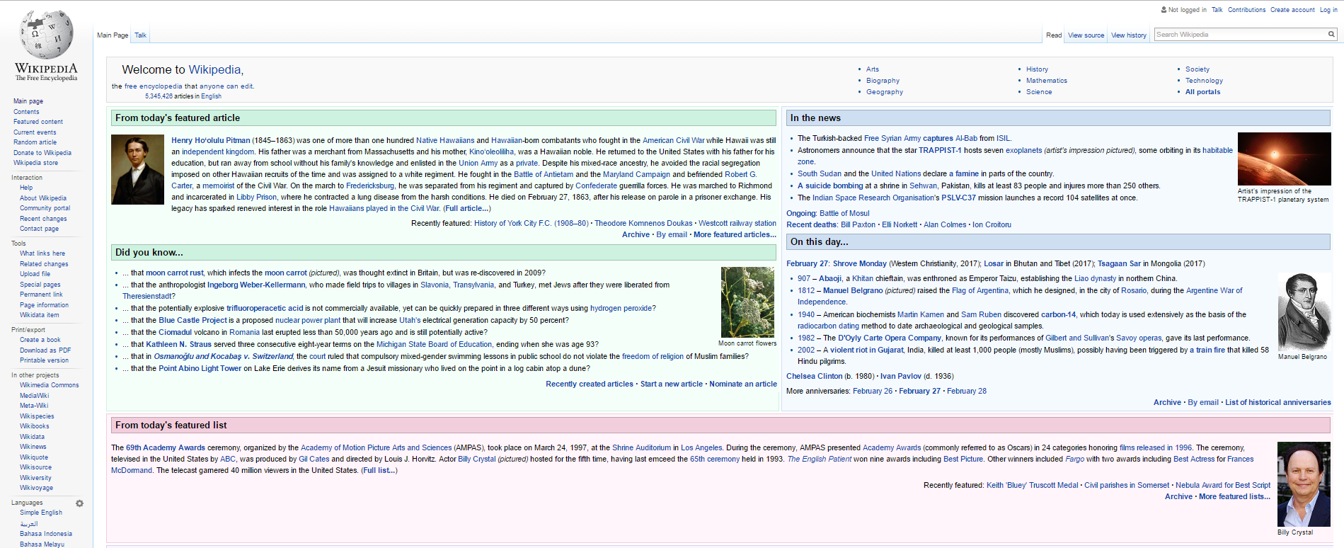
The wikipedia site has organised its information using headlines and sub headlines . There is a search bar to navigate anything you are looking for and there is an extremely helpful side bar with different topics like language settings, tools and interaction which I think is very good for a website to have an interaction section to be able to have a good build community.
Rythmos Greek Digital Radio
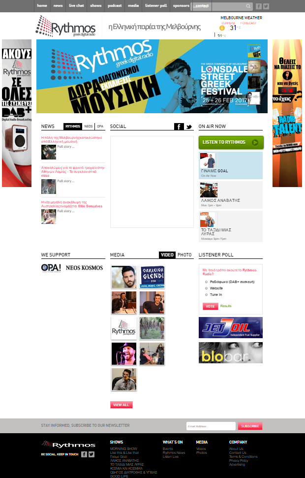
As well as wikipedia, the greek radio site has organised its information using headlines and sub headlines. A search bar and a bar with numerous topics are put to the top of the page. Also there is a way to contact the people from the social media on the bottom with a list of more topics and different pages.
Ebay
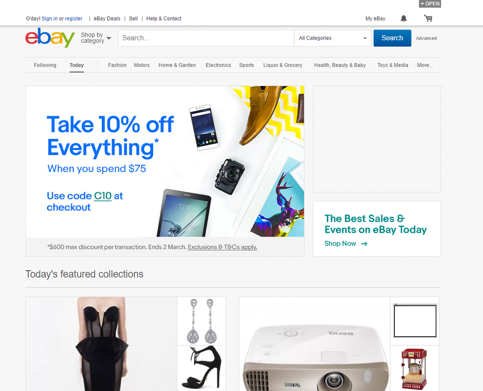
The ebay website, an online marketplace, is a very well organised website. There is a search bar, headlines for different products and icons for different uses such as selling a product, a cart and a messages icon. The website load time is quite fast and there is also a headline for help & support which is very useful for times to times. It seems difficult and confusing at the start but if you take another look at it, it is very easy to navigate on it.
Taste
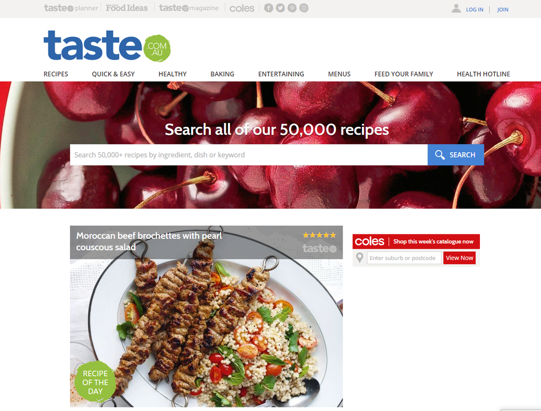
Personally, I haven't visited this website myself but straight away I can name a few characteristics that will help me navigate easily through the website. First thing I see is the name of the website (taste.com.au) and directly after that the enormous search bar. There are headlines for different pages that you might want to visit when in this site, social media page and at the top right corner a log in/sign up section.
